Building Your First C4 Diagram: A Quick Start Guide for Aspiring Architects
Software systems are complex. They grow, they change, and they often become opaque to the people who build them. Documentation bridges the gap between code and understanding. Among the various methods available, the C4 model stands out for its clarity and scalability. This guide walks you through the process of creating your first C4 diagram, focusing on structure and communication rather than specific tools.
Whether you are a junior developer stepping into design or a seasoned engineer refining your documentation, this approach helps visualize how a system works at different levels of detail. We will explore the layers, the symbols, and the mindset required to produce diagrams that actually help teams.
Why Use the C4 Model? 🤔
Before drawing a single shape, it is important to understand the problem this model solves. Traditional architecture diagrams often suffer from two issues: they are either too high-level to be useful, or too detailed to provide a big picture. The C4 model addresses this by enforcing a hierarchy of abstraction.
This structure ensures that you do not mix concepts. You do not show database tables when explaining the user journey. You do not show class methods when discussing microservice boundaries. By separating concerns, you make the diagram readable for different audiences.
Here are the core benefits of adopting this approach:
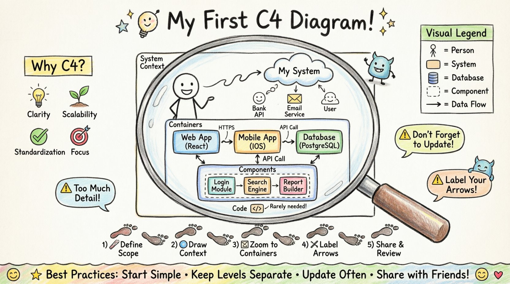
- Clarity: Each level answers a specific question about the system.
- Scalability: You can add more detail without breaking the overview.
- Standardization: Everyone on the team uses the same visual language.
- Focus: It forces you to think about what is actually important.
The goal is not to create art. The goal is to create a map that helps people navigate the complexity of your software.
Understanding the Four Levels 📊
The C4 model is defined by four levels of detail. Each level zooms in further into the system. You do not need to create all four levels for every project. Often, the first three are sufficient. Understanding the distinction between them is the foundation of your work.
Level 1: System Context 🌍
This diagram sits at the highest level of abstraction. It shows the system you are building and how it interacts with the outside world. It answers the question: Who uses this system, and what external systems does it talk to?
Key elements in this level include:
- Software Systems: The system you are documenting, plus other critical systems (e.g., databases, third-party APIs, legacy systems).
- People: Users, administrators, or automated processes that interact with the system.
- Relationships: How data flows between the system and these external actors.
Avoid adding technical details here. Do not mention servers, ports, or protocols. Keep it conceptual.
Level 2: Containers 📦
The next level zooms in on the system itself. A container is a distinct unit of deployment. It could be a web application, a mobile app, a database, or a microservice. This diagram answers: What are the major building blocks of this system, and how do they communicate?
Key elements in this level include:
- Containers: Web apps, mobile apps, databases, command-line interfaces, file stores.
- Technology: You should label the technology used (e.g., Java, PostgreSQL, Node.js) to give context.
- Connections: The protocols and data flows between containers.
Do not show the internal code of the containers here. If a container has internal complexity, that belongs in the next level.
Level 3: Components ⚙️
This is where the internal logic of a container is revealed. A component is a logical grouping of functionality. It could be a class, a module, a library, or a package. This diagram answers: How does this container work internally?
Key elements in this level include:
- Components: Business logic layers, data access layers, user interface controllers.
- Responsibilities: What does this component do?
- Interfaces: How components talk to each other within the container.
Keep this level focused on the logical flow. You are not mapping every single class, but rather the major functional blocks.
Level 4: Code 📝
This level is rarely necessary for documentation. It shows individual classes, functions, and database tables. It is usually generated automatically from the codebase. It answers: How is this implemented technically?
For most architectural discussions, this level is too detailed. It is better to use this level for code review or onboarding new developers to a specific module.
Choosing the Right Tools 🛠️
There is a wide range of software available to help you draw these diagrams. The choice depends on your team’s workflow. Some tools generate diagrams from code, while others are manual drawing applications.
When selecting a tool, consider the following criteria:
- Version Control: Can the diagrams be stored alongside your code? This ensures they stay up to date.
- Collaboration: Can multiple people edit or view the diagram simultaneously?
- Export Options: Can you export to PDF or PNG for presentations?
- Customization: Can you adjust colors and shapes to match your branding?
Do not get stuck choosing the perfect tool. Start with what is available. The value comes from the thinking, not the drawing.
Step-by-Step: Building Your First Diagram 📐
Now that you understand the theory, let us move to the practical application. Follow this sequence to build your documentation without getting overwhelmed.
Step 1: Define the Scope
Identify the system you are documenting. Is it a new product, a legacy refactor, or a specific microservice? Write a one-sentence description of the system. This keeps you focused.
Step 2: Draw the Context Diagram
Start with the big picture. Draw the system in the center. Add the people who use it. Add the external systems it relies on. Draw arrows to show data flow. Keep it simple. If you find yourself adding too many details, you are likely moving into the wrong level.
Step 3: Decompose the System
Take one system from your context diagram and expand it. This becomes your container diagram. Identify the major containers. Are there separate web and mobile apps? Is there a dedicated database? Label them clearly.
Step 4: Refine Relationships
Review the connections. Are they bi-directional? Is data being sent securely? Add labels to the arrows. Common labels include HTTPS, Database Query, or API Call. This adds semantic meaning to the lines.
Step 5: Iterate and Review
Show the diagram to a peer. Ask them to explain it back to you. If they get confused, the diagram is not clear enough. Make adjustments based on the feedback.
Visual Standards and Symbols 🎨
Consistency is key. If you use a square for a database in one diagram, do not use a cylinder in another. While you are free to customize, sticking to common conventions helps others understand your work faster.
Here is a reference table for standard shapes:
| Element Type | Shape | Example |
|---|---|---|
| Person | Stick Figure | Administrator, Customer |
| Software System | Rounded Rectangle | Order Service, Inventory System |
| Container | Cylinder or Rectangle | Database, Web Application |
| Component | Rectangle with dashed border | Auth Module, Reporting Engine |
| Connection | Line with Arrow | Data Flow, Control Flow |
Common Pitfalls to Avoid ⚠️
Even experienced architects make mistakes when documenting. Be aware of these common traps to ensure your diagrams remain useful.
- Too Much Detail: Do not try to show every API endpoint. If the diagram is cluttered, reduce the detail.
- Static Diagrams: Do not treat the diagram as a one-time task. Update it when the architecture changes.
- Ignoring the Audience: A diagram for a CTO looks different from one for a developer. Tailor the level of abstraction.
- Confusing Levels: Do not put components inside containers if they are not part of the same deployment unit.
- Unclear Labels: Every arrow needs a label. An arrow without text provides no information about the data being transferred.
Maintaining Living Documentation 🔄
Documentation decays over time. Code changes, features are added, and systems evolve. A static diagram becomes a liability if it no longer matches reality.
To keep your diagrams accurate:
- Link to Code: If your tool allows, link diagram elements to repository folders.
- Review Cycles: Include diagram updates in your code review process. If the code changes, the diagram should too.
- Automate Where Possible: Use tools that generate diagrams from annotations in the code.
- Version the Docs: Store your diagrams in the same version control system as your code.
Communication and Collaboration 🗣️
The best diagram is useless if no one reads it. Share your work. Use the diagrams in meetings, in pull requests, and in onboarding sessions.
When presenting a diagram, guide the audience through the levels. Start with the context to set the stage. Then move to containers to show the architecture. Finally, dive into components for technical details if needed.
Encourage feedback. Ask your team if the diagram helps them understand the system. If it does not, iterate.
Final Considerations 🏁
Building a C4 diagram is a practice. It gets easier with time. You will learn to see the system in layers and understand where details belong. The objective is not perfection. The objective is clarity.
Start small. Document one system. Draw the context. Then expand. As you grow comfortable with the model, you will find that communication becomes smoother and onboarding faster.
Remember, the goal of architecture is not to create drawings. It is to create understanding. Let your diagrams serve that purpose.
Summary of Best Practices ✅
- Start with the Context diagram.
- Keep each level distinct.
- Label all connections.
- Update diagrams when code changes.
- Use consistent shapes and colors.
- Share diagrams with the team.
- Focus on the audience, not the tool.
With these principles in mind, you are ready to document your architecture effectively. The journey of a thousand diagrams begins with a single line. Draw it, review it, and refine it.


Comments (0)